 |
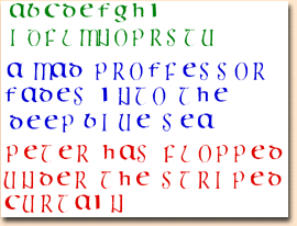
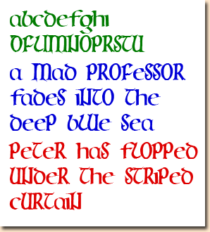
Celtic calligraphy - an alphabet from a modern book
This one still needs more 'tweaking' (fine-tuning), I really don't know why, unless it's because the Du Beau Chesne font was just beginner's luck!
One problem was that the small letters were the same size as the capitals, so you had to use a smaller size for them if you were to use them at all - very handy for fast work!
Another was that some letters took up much too much horizontal space.
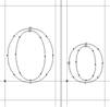 |
I got a clearer idea of how things should look by opening a good font in Fontographer - I chose Apple Garramond - and looking at the sizes and spacing, relative to the bounding lines. The 'Transform' command in the 'Element' menu is very handy ...
 |
It was indeed easy to fix the spacing; the capitals were far too thin compared with the small letters, but I used the 'Change Weight' command, with the opions 'don't change vertical size' and 'don't change horizontal size'. One day I'll finish the other letters ...
|
|
|
|