 |
 |
 |
 |
 |
 |
 |
 |
 |
 |
 |
|
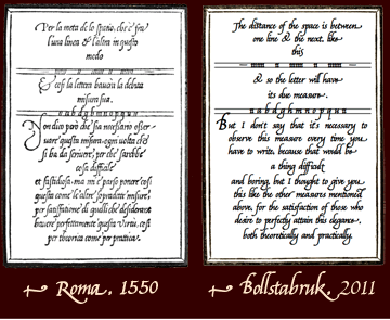
| Giovambattista Palatino (1550) shows how to draw an 'a' here |
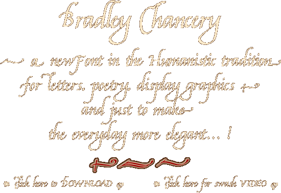
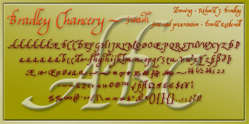
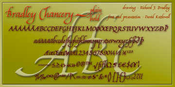
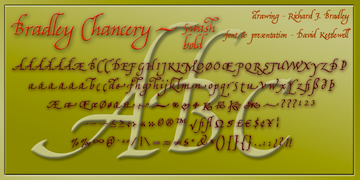
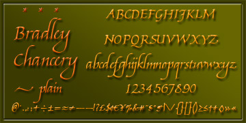
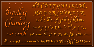
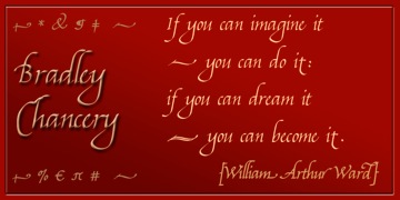
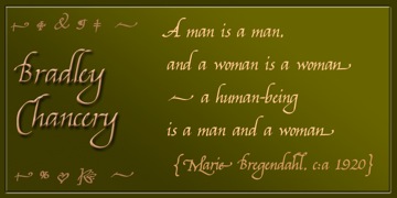
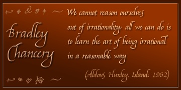
This family of fonts has four members: the basic plain font has regular and bold weights, and each of those has its swash variant (labelled 'italic') which you can use to replace single letters giving a dash of spice at the beginning or end of a word, phrase or line. Of course you can use the swash forms together, but it's a pretty stressful effect and that's not our idea!
While the capitals are only 50% higher than the lower-case letters in this style, the ascenders and descenders are much longer than is normal in other styles. We have set the the space between the lines (the 'leading', traditionally marked by pieces of lead) so that the lines don't run foul of one another, but depending on how much text you set in this type and how it sits, you might choose to set the lines closer together in your word processor, layout, or graphics programme.
Instead of swash variants of the numbers, there is a selection of ornaments.
Richard Bradley writes:
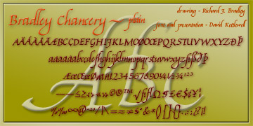
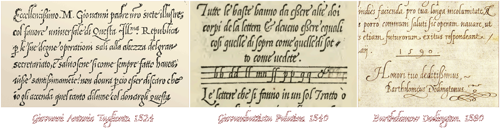
My inspiration for this font was the wonderful Humanistic Cursive writing of such 15th and 16th century Italian writing masters as Giambattista Palatino and Giovanantonio Tagliente as well as Bartholomew Dodington, who, as Regius Professor of Greek at Cambridge University wrote Latin, Greek and other languages in a singularly beautiful example of the Italian cursive style (examples below).
I wanted to make available a hand-written font in that style for use today using the modern digitising process which was completed by David Kettlewell from my scans of the original hand-written letters.
The letters were written using a Parker Frontier fountain pen fitted with the excellent Parker bold italic steel nib. I wrote the letters on old computer print-out paper with regular bands across it. The x-height (the height of a, c, e etc) is two-thirds of the capital height, with rather long ascenders (b, h) and descenders (g, y), following the proportions of the original writing in the early manuscripts and emulating the fine writing of those wonderful early scribes.
David made the font available for computer use using the amazing FontLab Studio.
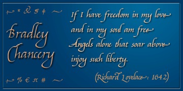
We trust that this font will prove useful to folk for a wide variety of typographic needs in its bold and regular weights and the with added extra Swash font, which again follows the early masters, in adding extra flow and decoration to any wording set in this new font.
January 1st 2011
- you can download this page as a PDF ready to print on paper as at A4 size here -
A note on horizontal spacing - tracking
We make our fonts so that they look right on our systems, and those of our testers: but we discover that there is an enormous difference in how different programmes interpret the information contained in the font - at each programme's basic setting, the tracking (horizontal spacing) varies as much as 10% between the tightest and the loosest. Click on the thumbnail on the right to see some examples from a real-world test.
So do remember that in any serious word processor, or graphics- or layout-programme, you can adjust the tracking so it looks right in your context!
We also notice an incredible difference in the handling of soft edges (anti-aliasing): even though we read that Windows these days applies sub-pixel rendering as an operating system feature via Microsoft's ClearType technology, our example from NotePad still uses only black and white with no intermediate greys, the outlines of the font deformed by lumpy stepped edges, while in the simplest text-editor on the Mac text is as true to the original design as in a dedicated word processor and layout-programme like Apple's Pages. You can click on the example below for a closer look.
