Capitals in an uncial alphabet - historical models - 1 of 9
Historical Models
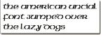
The American Uncial font created in 1994 by URW Software was evidently designed as a minuscule alphabet, i.e. without capitals. There were two versions distributed with Macromedia's FreeHand Graphics Studio 7, the only difference between the two being in the way they deal with capitals.
click for a closer view
The basic version, which goes under the catchy name of "AmeriUncD", shows no change at all for the capitals:
click for a closer view
But when a font-maker leaves blank the slots of one style - upper or lower case - you either get boxes when you type the letters which aren't in the alphabet, as here in TexEdit:
click for a closer view
or empty spaces, as here in Photoshop:
So, with a font that has only small letters and blanks for the capitals, a user has to either use a text with no capitals, converting all their capitals to smalls,or typing without capitals in the beginning - inconvenient if you want to re-use it another time with capitals - or else change to another font for each capital; so the maker of this font repeated the small letters in the slots for the capitals, and the font works without showing blanks, even if you type capitals, or apply the font afterwards to a text which uses capitals.
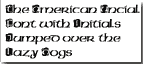
The other version, with the equally-catchy name "AmeriUncIniD", gives initials which are the same shape and size as the small letters, but displayed against a trendy little black patch of coloured shadow, the letter itself showing up as white against it.
click for a closer view
click for a closer view
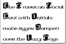
So they are 'initials' rather than 'capitals'; and from a modern point of view it's a bit odd that they're no bigger than the 'smalls': of course you can enlarge the initials individually if you want, and can be bothered, though the type-designer would probably think you were abusing his font...
Even so, that might not be what you want, of course ...
|
|