Programmes which handle vector graphics - a deeper look
Adobe's collections - testing InDesign's PDF
Since I discovered that wonderful little Mac shareware
PrintToPDF, I have saved SO much time and frustration, messing around with creating an extra PostScript file, checking dozens of hidden settings in Acrobat Distiller, and frequent errors.
But the drawback is that it can only recognise a few fonts: it very nicely converts to bitmaps any others you use, which is fine at 100% view, but they look lumpy if you re-size them, of course.
So when I discovered that InDesign does its own export to PDF without you having to mess around with the Distiller, I wondered how it handles fonts ...
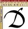
click for a 100% view
Here's the delightful result it produced with my handwriting font, even under Windows 98, which I haven't otherwise experienced as producing font stuff which is particularly easy on the eye ...
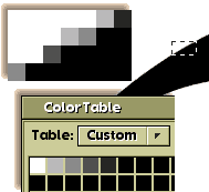
Fascinating that even this comfortable degree of softness only needs four different shades of grey at the edges to give a smooth transition between black and white. Otherwise Adobe's Type Manager, for example, uses 15 different tones to blend the font colour with the background on screen.
|
|