The rough and the smooth: bitmap and vector fonts
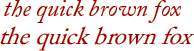
A true Italian, and a skewed Roman
Adobe Caslon Pro, italic (above)
and Roman skewed in Photoshop (below)Of course you can skew Roman text in an image editor like Photoshop, but there's a world of difference between a skewed Roman font and a designed italic font - both proportion and shape can be quite different.
This example, Adobe Caslon, is an OpenType font, rendered from vector paths to pixels and then skewed in an image editor; but it can also be interesting to see how the the conversion between plain and italic works with TrueType fonts. To keep the picture simple I've concentrated here on lower case forms, the basic Latin alphabet, and just two styles, plain and italic: if you like to make our own comparisons, you might look at upper case letters, other characters, and bold and bold-italic styles too ...
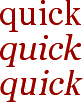
Microsoft's Georgia in TexEdit, regular, italic
and regular-skewedclick for the whole alphabet
Georgia has a plain and an italic version in the same suitcase, so normally the italic version is used when you select italic style in your word processor; if you remove the italic version from the font suitcase, and then select italic style in a word processor, the plain version is simply skewed: you can see here how many of the letters were designed with quite different shapes for the real italic style.
Microsoft's Verdana in TexEdit, regular, italic
and regular-skewedclick for the whole alphabet
Verdana also has a plain and an italic version in the same suitcase; but whether you use the proper italic style or remove the italic version and let the software skew the plain version, the result seems to be the same: Fontographer also offers you the option of simply skewing your plain font to make a quick italic one, and one wonders what the point is, when the TrueType routines do the same for you.
Galapagos Design Group's Tempus in TexEdit, regular and italic
click for the whole alphabet
Tempus Sans is open and honest about the whole thing - there is only the plain version, and you're welcome to ask your word processor to skew it or thicken it or both, it works as a cheap and cheerful everyday thing on those terms: I say 'cheap' because it saves 75% of the file size compared with Verdana ...


|
|