The rough and the smooth: bitmap and vector fonts
The traditional bitmap font
I find fonts one of the most miraculous bits of the way the Mac works ... the greatest part of the miracle is that they work so smoothly without the user needing to know anything about what goes on under the bonnet ... Actually they work pretty well under Windows too, partly thanks to Apple technology ...
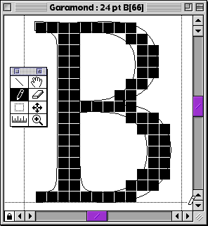
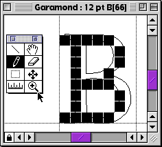
Originally, a computer type-face was described in a fixed number of pixels
working like Photoshop, Fireworks or a Claris/AppleWorks painting module
called a 'bitmap' font: it only works properly at one size, you can't scale it satisfactorily.
So there has to be a different font for each size, the type-designer creates separate drawings for italic, bold and bold-italic versions, and they have their own fonts, too, again separately at whatever sizes are needed.
|
|