 |

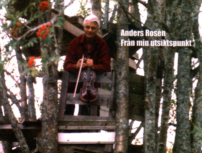
nders is a traditional folk fiddler, one of the foreground figures of the Swedish folk revival, just about the first person whose music I heard when I first came here in the 1970s. Apart from music and typography, we also have in common a passion for the mediaeval longbow, and I look after the web-site for his record company, which was the first independant one in Sweden. He made his illuminated and decorated capitals for the cover of a double-LP documenting in sound and words the history of the Sweden folk-dance 'polska', which has its origins in the Polish way of making a triple-time dance out of a walking tune or march in the 16th and 17th centuries, sharing its history with the polonaise.
"It's great if you can use something I've done. But the truth is that I haven't done much more than to copy what others have done ten times better - I haven't really done enough calligraphy to even call myself a beginner ... but I love beautifully formed letters.
"The set you've called 'Fancy capitals' I took from an old bible. I think I made the 'Plain capitals' from older models I've seen in various books - I don't now remember which!
"Otherwise I find that Latin letters in all their variants, black-letter versions included, are the most beautiful way of writing - much more so than the Arabic or Chinese. Perhaps people see calligraphy differently in, e.g. Japan and China, but I think basically they're the same thing. It's the same with drawing, painting, music, etc. You can't say that one method or philosophy is more right than another Some people create masterpieces with a few sweeping movements, others take almost an eternity."
|
|