| After I had made Chiswick Illuminated Capitals, and Lydia in Canada said they didn't do quite what she expected and she had chosen Sapphire instead, it suddenly struck me that this font was a natural for making in layers, too: so now the leaves or petals are there under the lower-case letters, you can type the same thing on two different layers and place them one on top of the other. The basic version still has the petals or leaves on the upper-case letters, the 'Black' version doesn't. In the Black version, you have the petals that belong to the black numbers under 'Old Style numerals'; if you don't see them that way, you can use the 'Black numbers' version of the font, and then the leaves for '1' are at 'a', 2=b, 3=c etc., and the petals for the zero are at 'j'. Here you have a video that shows how I did it, then some still demos: the first two rows use the old version without the separate layers, the third and fourth rows use the new layered version. |
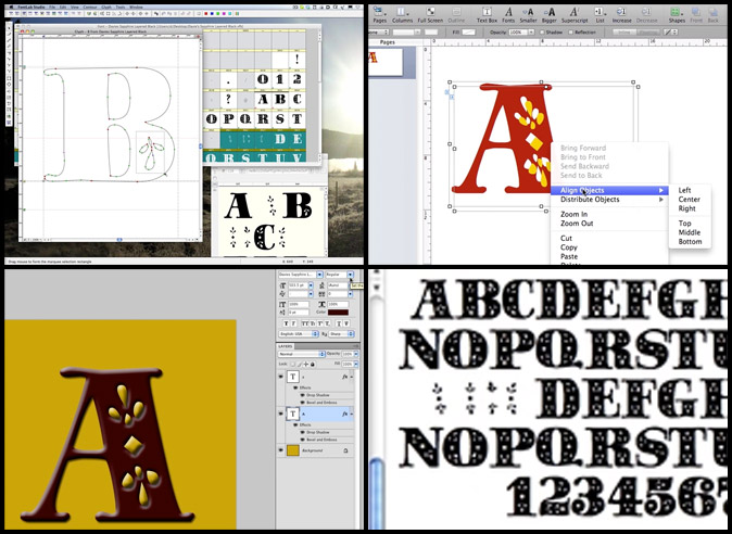
click to view video |

