
- and you can even use the frames, fills and backgrounds with caps from other fonts entirely.
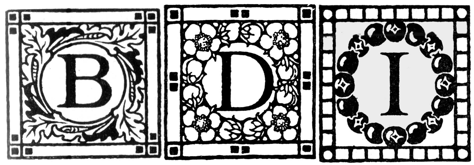
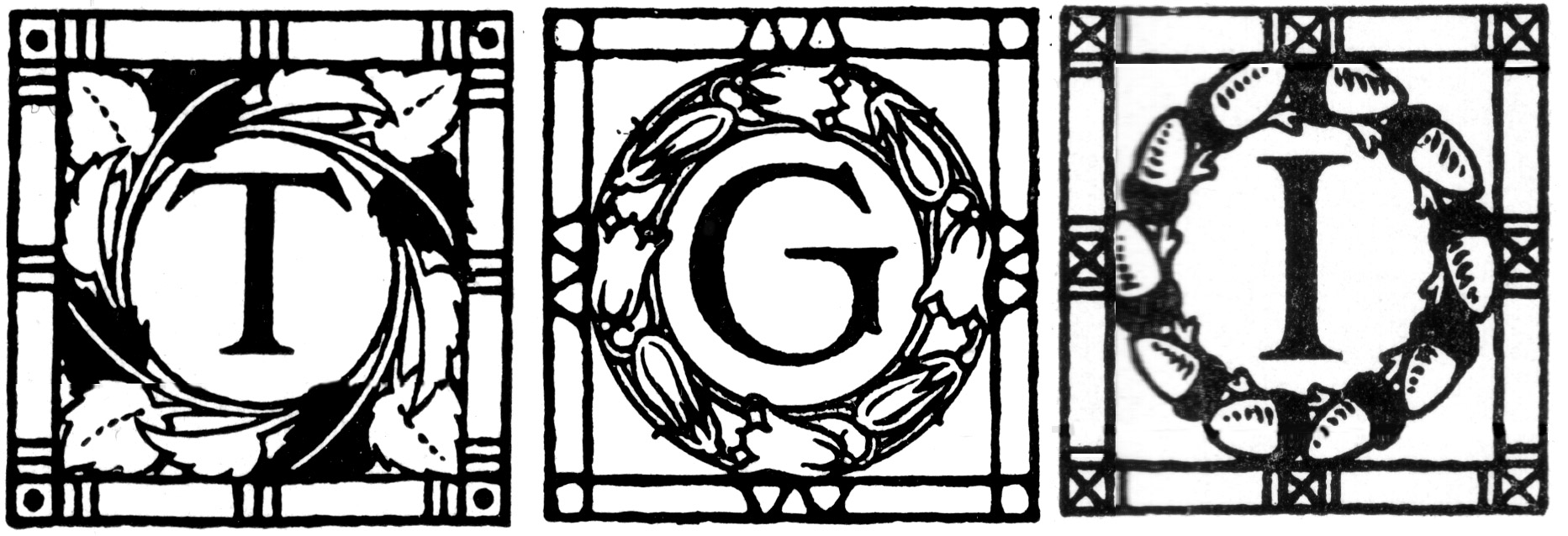
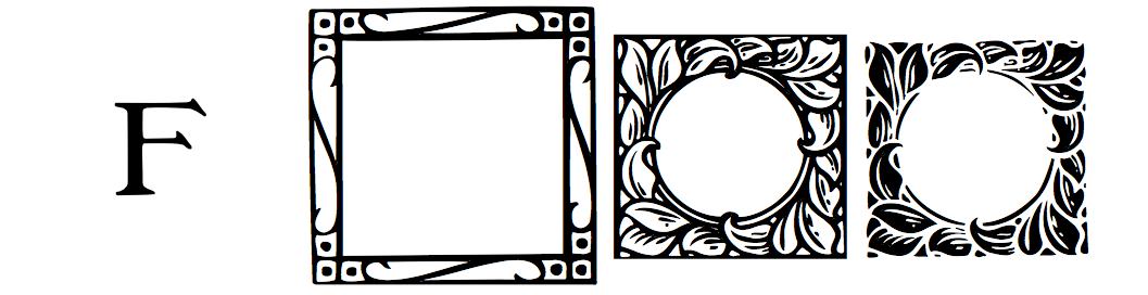
Note that the different letters are intended as single drop caps: each is a comfortable unity of letter, frame and background, reflecting the divergency that nature features, but they weren't designed to be used together, and they are different sizes: you decide whether the difference is significant, and whether or not you can stretch things to make them fit as you want to.
SO: you can have |
||
 |
|
|
| - a filled-in letter on its own | - a filled-in letter in a square frame with an empty background | - the reverse of that, an empty letter in a filled-in box |
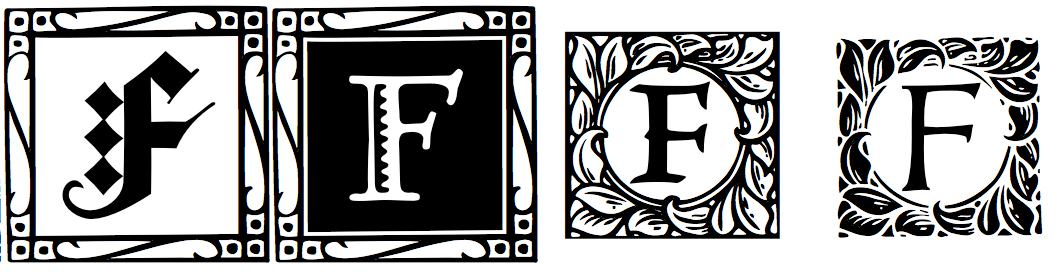
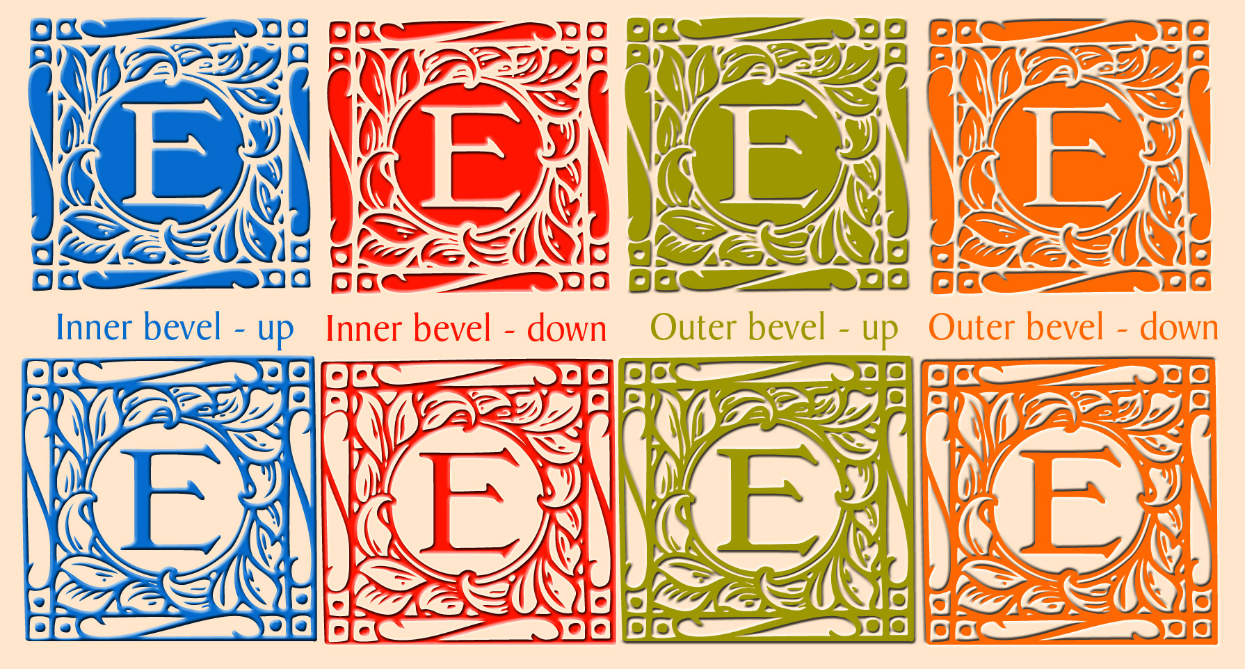
— combine two of those to get letter-and-frame in one colour and background in another colour |
— combine another two of those to get the letter in one colour and the frame in another colour, with no background |
— combine all three to get three different colours |


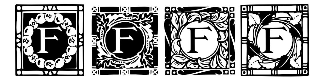
| as we saw at the beginning, you can have it the way Emmy drew it originally, a filled-in letter with decorative frame and a verdant fill, like a 'positive' print in photography, though all in one colour | 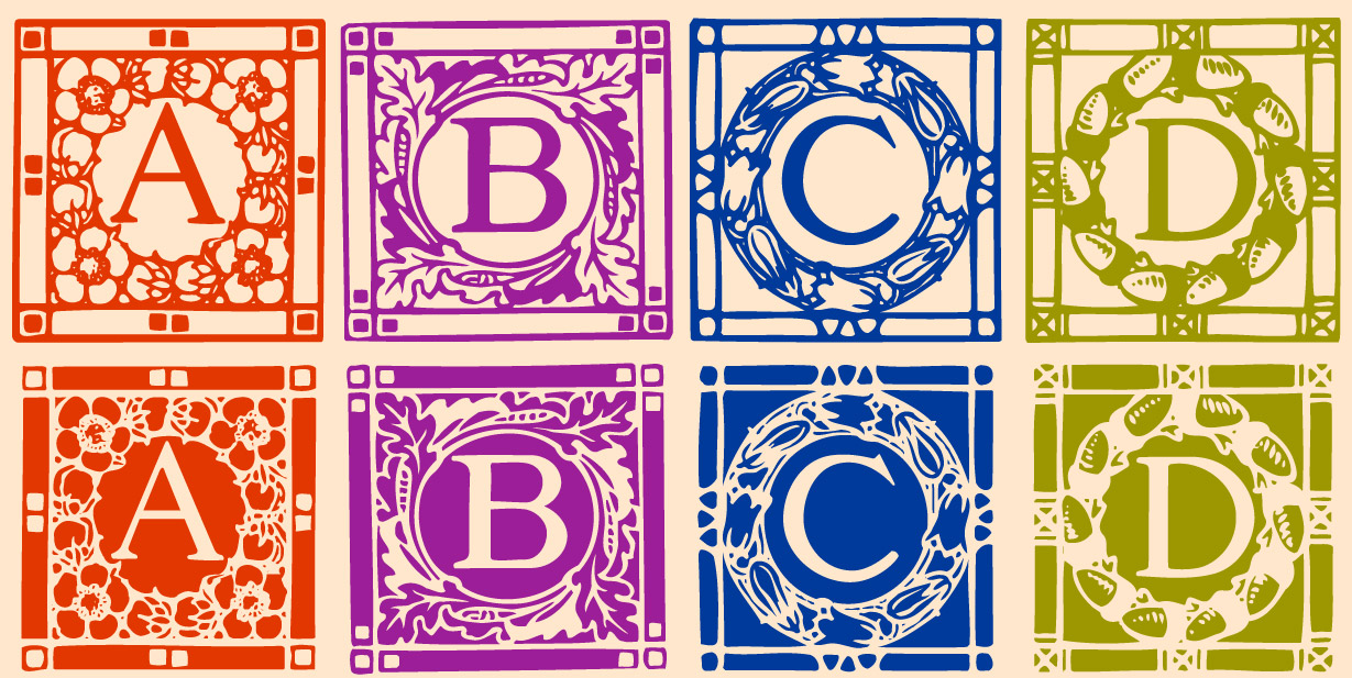 |
| and you can have it reversed like a photographic 'negative', still all in one colour |
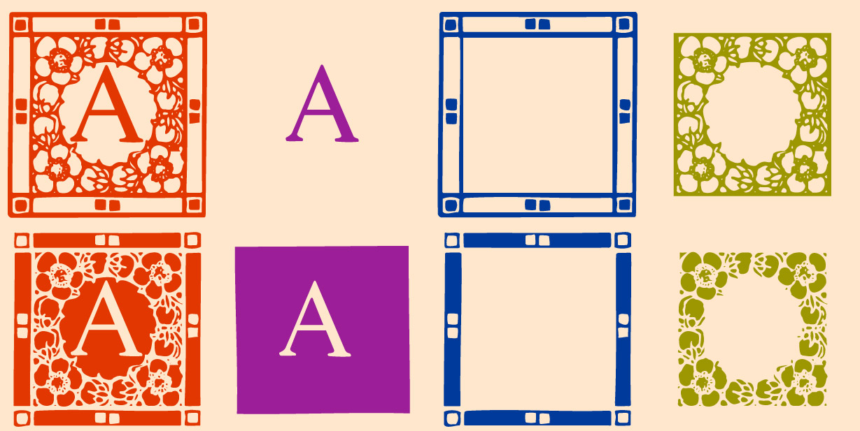 |
— then you have the various elements separately, 'positive', as Emmy drew them |
| — and you can have all those reversed, 'negative' |
combining two or more of these gives 34 new variants — and you can put a box behind your final cap |
 |
 |
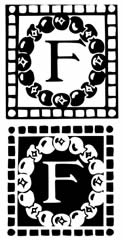
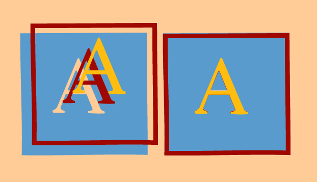
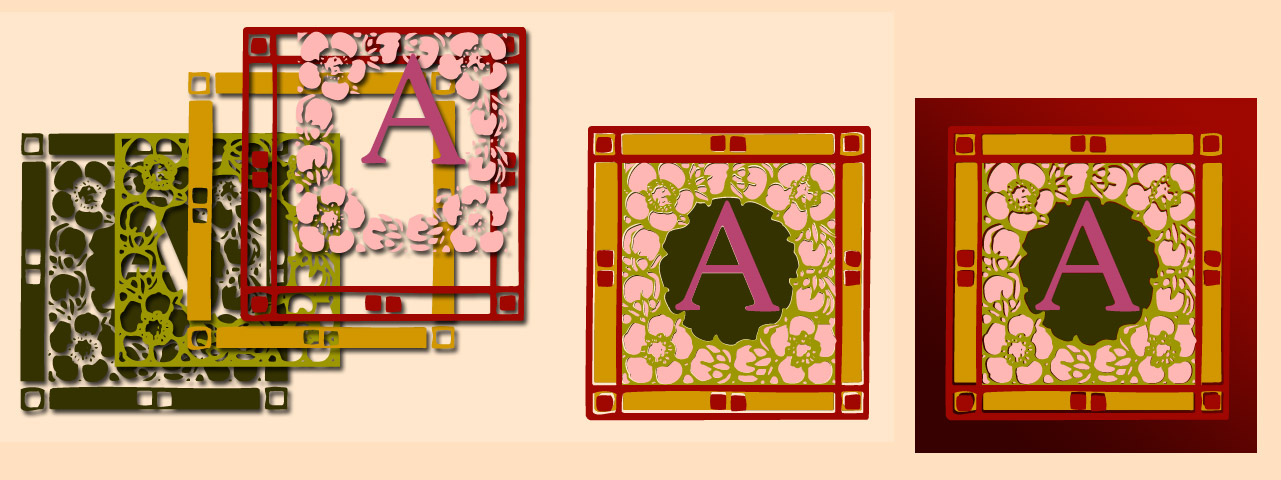
— you can vary the colours, like light-on-dark and dark-on-light: — but even dark-on-dark and light-on-light can be effective |
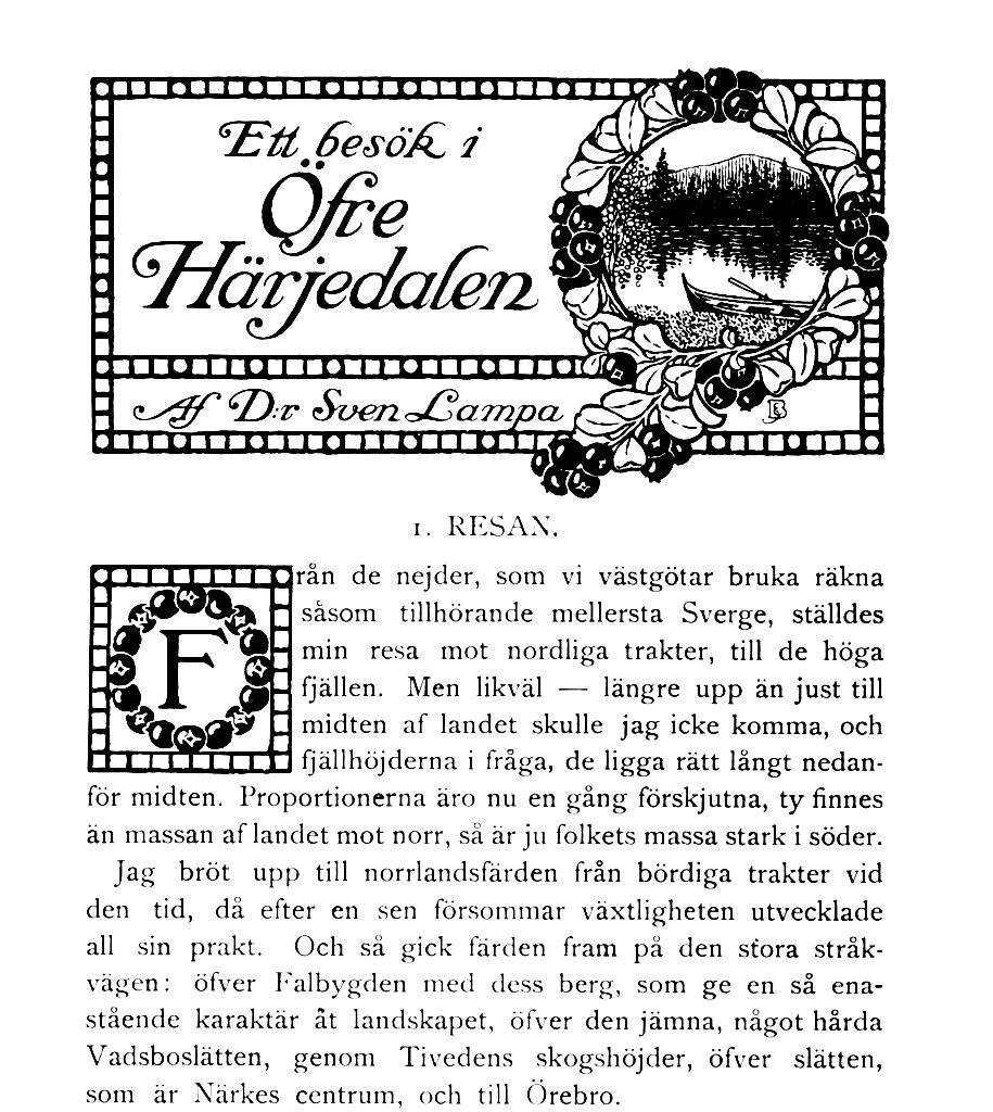
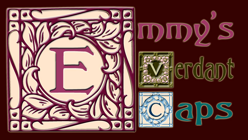
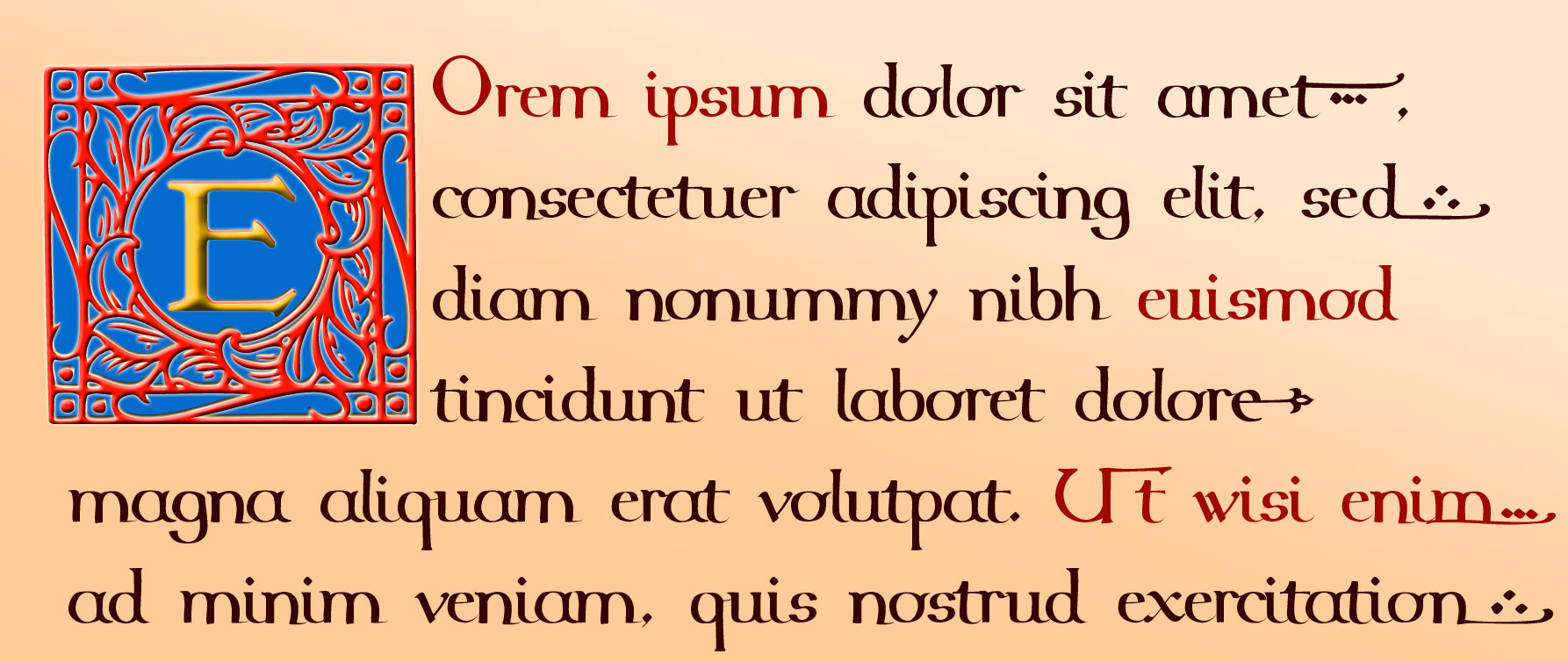
You can use them just as decorative capitals, like in the title of this page: — though they are really intended as proper drop caps, where they take up three or four rows of ordinary text: |
 |
 |
 |
and once you get started applying layer effects in a programme like Photoshop, there really are as many possiblities as there are stars in the heavens ... Then there are also matching ornaments with the same themes - page-fillers for the end of a chapter or section - in the sister-font Emmys Decorations 1910: next off after that will be the chapter headings ... |
 |
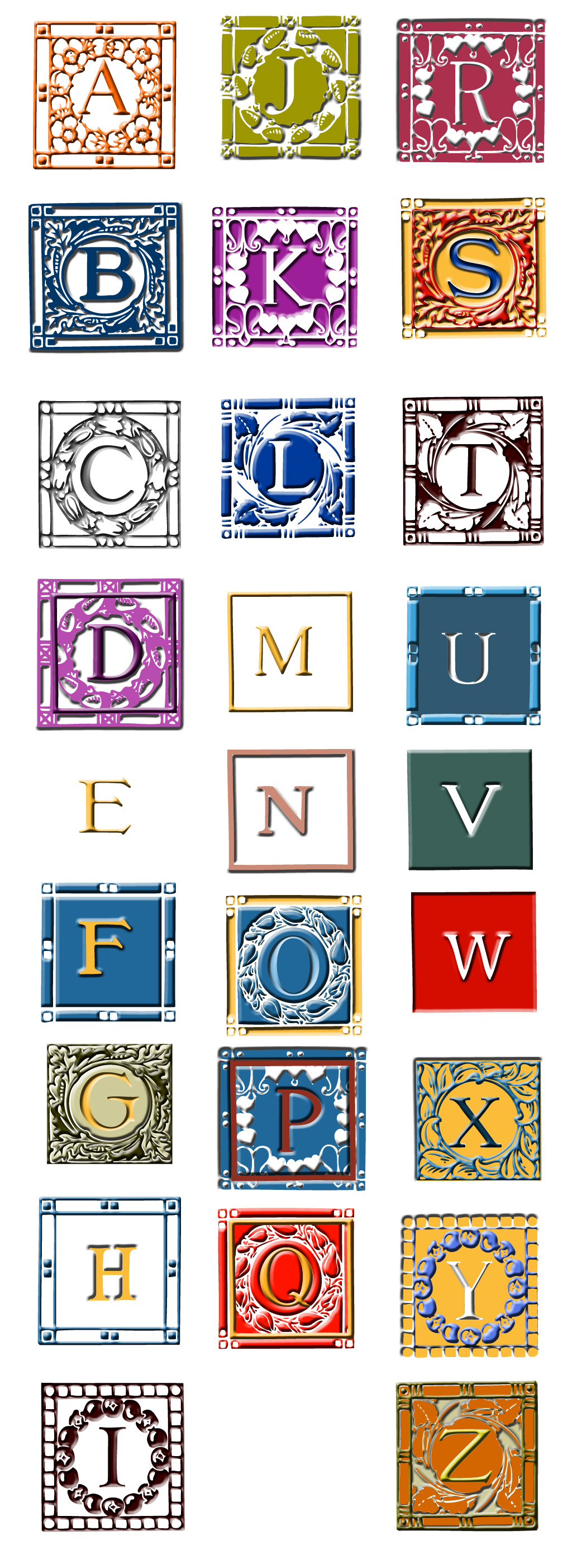
I've made an 'alphomegon' - something that uses all the letters form A to Z - with 26 different variants of pattern and bevelling, here it is below If you'd like the alphabet on its own ready-to-use, here it is on the right: 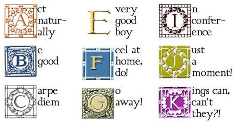 |
 |
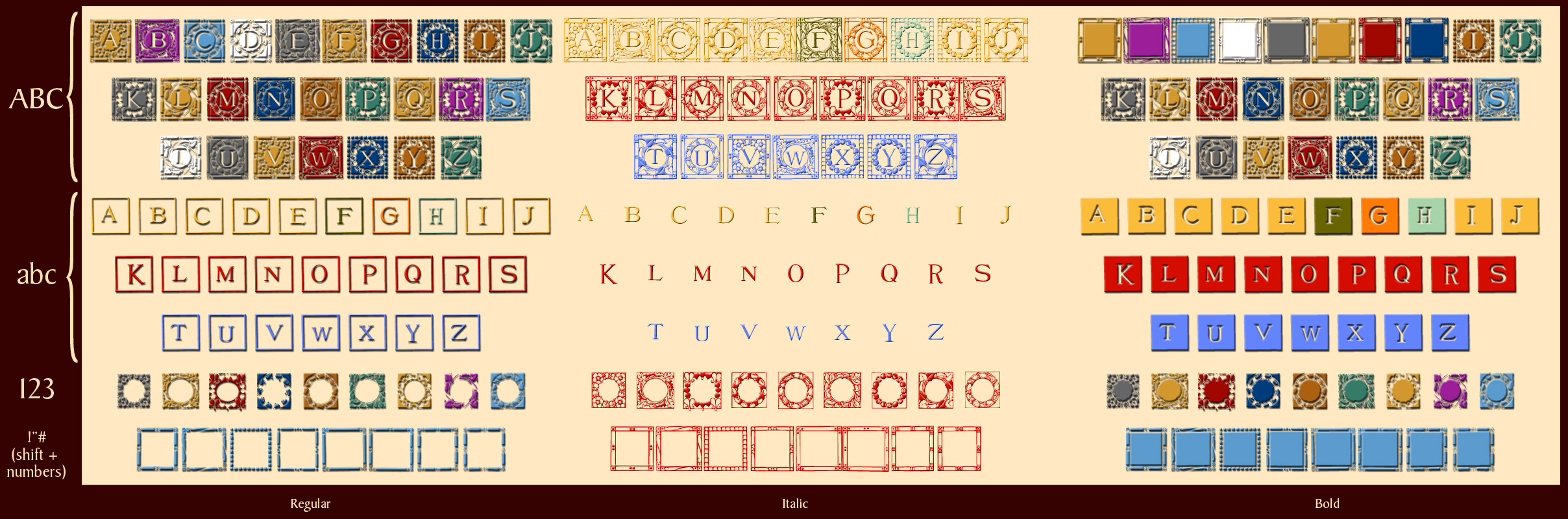
... so now all you need to know is where all the different versions are: and here are three tables you can have by you, one is a key to the essentials, the others are two different approaches to the complete repertoire - the first two are PDFs, so you can zoom in and out all you want to!
 |
 |
Download David's fonts - 63 Mb - last updated 9th March 2011