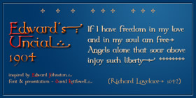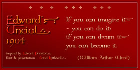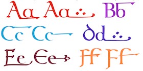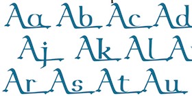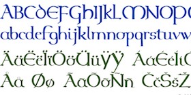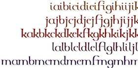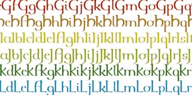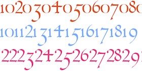
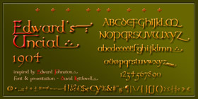
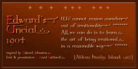
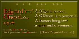
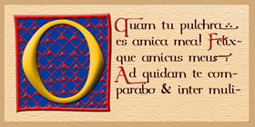
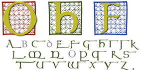
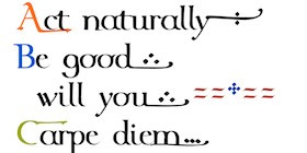
In the greater world of today, Edward Johnston is perhaps known mostly for his highly effective but perhaps rather unexciting font for the London Underground; but in calligraphic circles he is given the credit for having more-or-less single-handedly started the 20thC movement for Italic hand-writing, with one book, which was first published in 1906, reprinted dozens of times, and indeed is still in print today - Writing and Illuminating, and Lettering. He gives there two alphabets which he proposes should be used together as a model for a basic repertoire - an uncial and half-uncial used together as a modern upper and lower case respectively: of course it's early mediaeval rather than the renaissance alphabets which later became the basis for 20thC calligraphy. Edward Johnston drew the two script proofs on different plates, and they are printed on different pages in the book: and when you put them side by side you see that the caps are so much thinner than the lower case that you really can't use them together as they are, at least with today's idea of uniformity; but they are of course models for handwriting rather than masters for creating a font, and with a degree of manual adjusting, the result is rather delightful alternative to, on the one hand, historically-authentic uncials, and on the other, the ultra-smooth and regular modern interpretations which most fonts today offer. Alongside the regular font, there is a version with swash capitals to start words off with, and swash lower-cases, mostly to end short lines with, though b f k p q can work with letters after them too: to fit in with Microsoft's idea of how a family has to be, this is called 'Italic' in the font menu. One interesting detail concerns the numbers, for which Edward Johnston suggests that, after a 0 and a 1 which are as high and low as an 'x', neither ascending nor descending, the even numbers might ascend while the odd numbers descend: 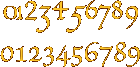 This makes for a refreshing contrast with today's implementation of these 'old-style numbers', where 2 is 'x'-height like 0 and 1, and 4 descends with its neighbours 3 and 5 rather than ascends like 6 and 8. Edward Johnston gave a model of a decorated capital O with a patterned background: here the two elements are separated, so you can use the background with various colours and with any of the capitals. Or indeed capitals from other fonts. Grateful for any reactions, as always ...  from Edward Johnston, Writing and Illuminating, and Lettering, 1906 and later reprints. |
 |
|
|
 |
|
 |
 |
|
 swash character set |
 all swash caps in context |
|
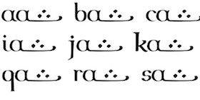 all combinations of a regular + a swash lower case |
|
|
|
|
|
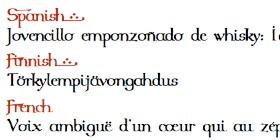 acccented languages |
|
|
|
|