LEAFY LOMBARD CAPS

you can click on most of the thumbnails for a full-size image!
There's a long tradition of filling letters with leafy ornaments, from the Middle Ages on. The question is how do you get the living, multi-coloured, 3D effect which the old manuscripts have, with a single-colour 2D computer font?! Here's one solution, inspired by some display capitals made 200 years ago by Giovambattista Bodoni of Parma - Bodoni made them fatter than usual, and I've made them fatter than ever to make room for the leaves. |
- a complete character set of all three font variants, with an overview of different effects |
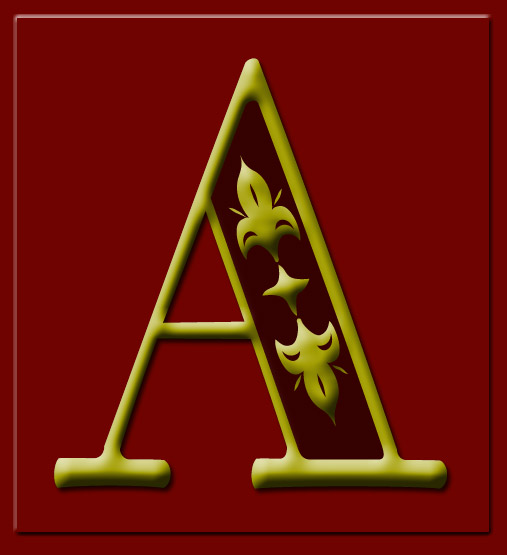
- a close-up view of one 3-D letter |
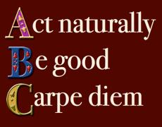
- an 'alphomegon', each letter used in turn as a drop cap for a phrase of text
|
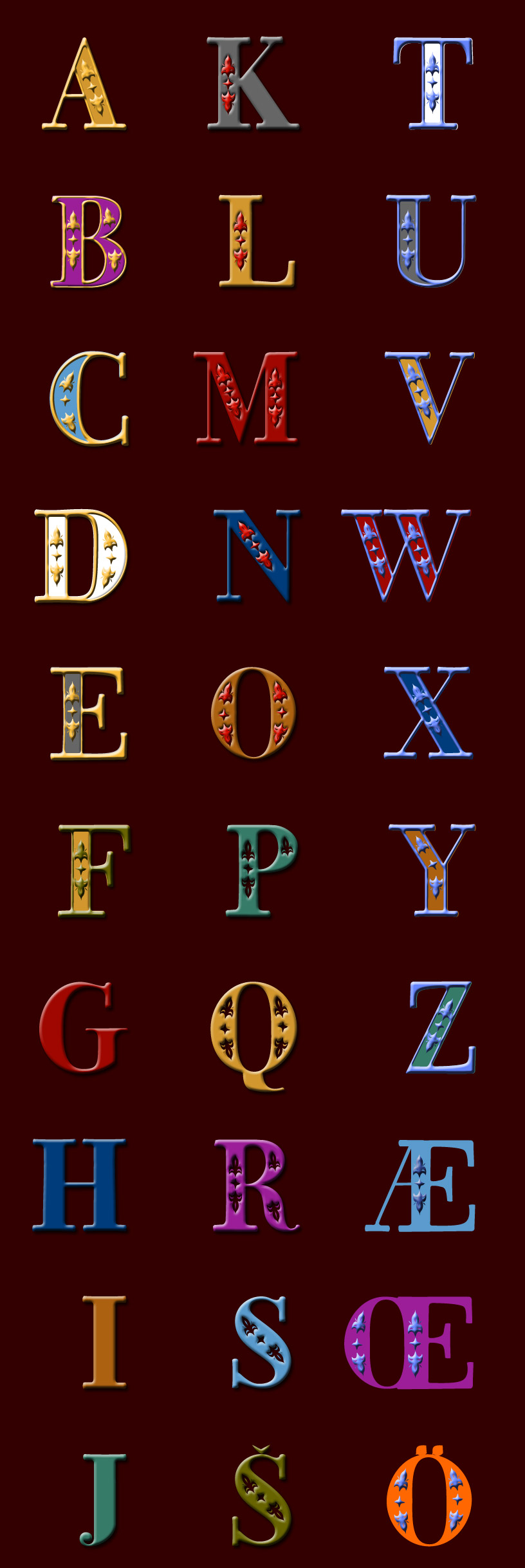
- a ready-to-use 3-D alphabet |
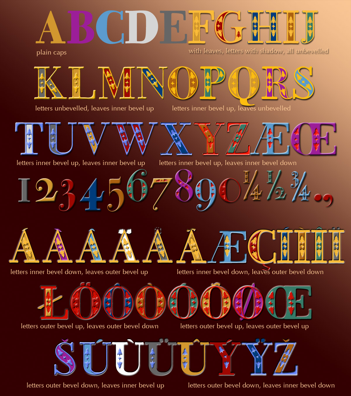
In the regular version of the font, letters with cut-out leaves are mapped to the keys for the capital letters; you get the leaves for each particular letter by placing the lower case of the same letter on top in a separate layer. The numbers also work as you'd expect, and holding down the shift while you type the numbers should give you the leaves that belong to them, at least with UK, US and Swedish keyboard layouts. Maybe this aspect needs more work, let me know if it doesn't work for you.
The bold version of the font gives you two more versions of the alphabet: the upper-case (capitals) is a plain version of the letters in case you want some really fat characters without the leafy cut-outs, while the lower-case is a negative version of the leafy caps, which you can use with or without the leaves as a second layer.