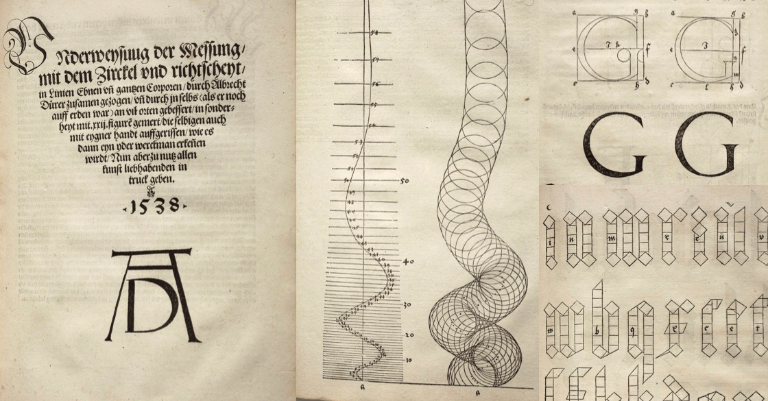
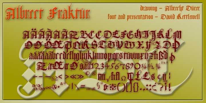
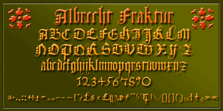
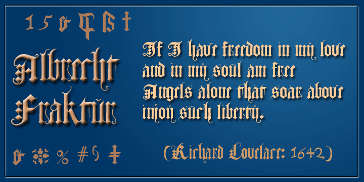
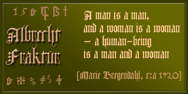
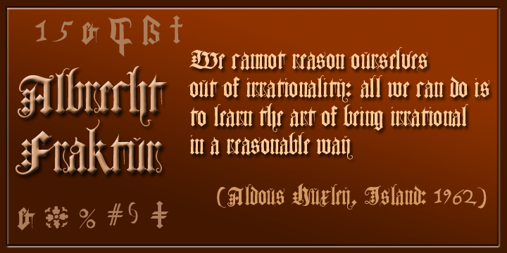
In his 1538 book on measurement, Albrecht Dürer gave clear descriptions and drawings about the proportions of the letters in both Roman and 'fraktur' alphabets (from Latin 'fractura', meaning that it's broken up with lots of different angles rather than smooth curves). Here is the fraktur alphabet as a font completed for use today, with a few characters modernised and some gaps filled. Of course there are countless examples of fraktur fonts already circulating, and indeed the 'Scriptorium' foundry even has another version of this particular one; but we have different approaches to some of the questions raised, compared with their normally high standard, the tracking (horizontal spacing) looks surprisingly uneven in the taster at MyFonts, and their 92 glyphs don't seem to have the 'extras' like letters with accents and other diacritics: among the 260 glyphs in our version, I've added those and the modern symbols which Dürer would surely have embraced if he had had access to the internet, so the result is very much more complete.
(click) from Albrecht Dürer's |
 |
 |
 |
 |
|
 |
 |
|
 |
||
 |
 |
|