David's own fonts - Illuminated capitals
Romantiques
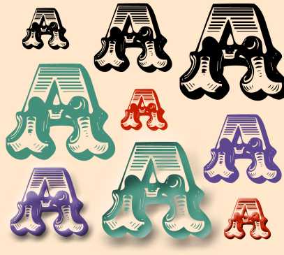
Again, only the A so far ...
When I compared it with the original, I thought there really wasn't any point in continuing: but when you see it on its own, it seems almost usable ...
|
|
|
David's own fonts - Illuminated capitals Romantiques |
|||
|
|
|||
|