Why vector graphics?
lumpy bitmaps at the wrong sizes
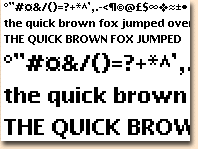
Chisel bitmap font,
at the size it's designed to work at,
and at twice that sizeEven when a bitmap font like this does work at one size, it still looks horribly lumpy at any other size:
For most of us, it's essential to our concept of a font that it works equally well as any size.
Adobe has a range of programmes including Acrobat, Illustrator and Photoshop, which make a remarkable job of evening out the differences, and for PostScript fonts Adobe has a free
Type Manager which makes things better within certain limitations.
But for normal use, the solution has been to construct the font in a completely different way.

|
|