![]()
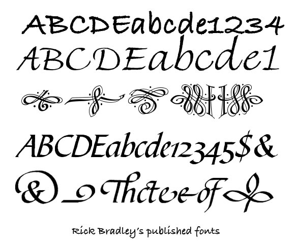
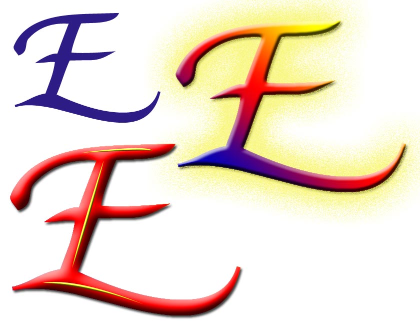
excerpts from Rick Bradley's published fonts: click on a thumbnail picture for a larger view in a new window |
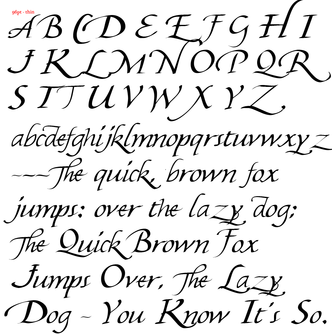
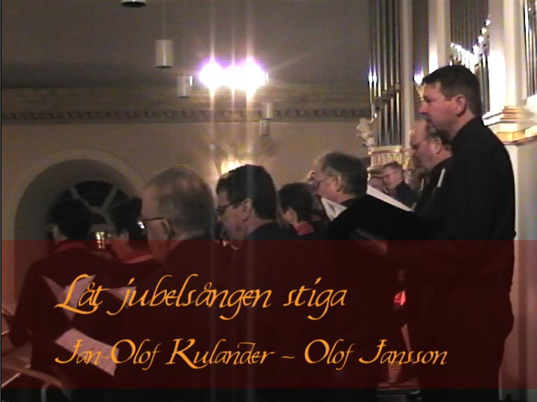
It really was a New Year - it's ages since I did anything with fonts, and Rick was quite justly skeptical about the technical quality of my first results and felt we would need to spend a good long time together tweaking all the details. It didn't seem a very practical proposition with me in the north of Sweden and him in Portsmouth, I was thinking it was a case for using Skype to bring us together: but even after only a week he said I'd got much better at it and he was ready to consider moving forwards despite the distance, and agreed to my using one of the fonts for the captions on a DVD of a local choir. It should perhaps be said that this was a week when I was so stimulated and excited by what was happening that I was only sleeping about three hours a night. Type can get you like that, not to mention being encouraged by a professional designer.
- click on a thumbnail picture for a larger view in a new window
 |
 |
 |
 |
 |